As I wrap up my work with Amy’s Trust, I’ve been thinking about what made this project – bridging design with equine healing – so different from my usual practice. As an artist who typically works at the intersection of digital and physical realms, exploring consciousness through technology, I initially wondered how my background would translate to the world of equine facilitated learning.
Finding Common Ground
What I discovered is that despite working in very different fields, both my art practice and Amy’s Trust prioritise human connection. My work uses art and technology to point people toward something deeper within themselves. Amy’s Trust does something similar – using the relationship between humans and horses to guide people toward healing and self-discovery.
The key difference is approach. My world thrives on abstraction and experimentation, while Amy’s Trust is built on an approach with established frameworks for equine facilitated learning. This contrast actually strengthened our collaboration. Working with a charity serving vulnerable children demanded a level of care and professionalism that challenged me and pushed my creative practice in new directions.

Working with Ruby
Collaborating with Ruby has been a transformational experience. She’s one of the most committed and professional people I’ve worked with – a former vet whose career shift aligned perfectly with Amy’s Trust at just the right moment. The quality of work I was able to produce was directly influenced by Ruby’s clarity of vision and genuine passion for the project.
I’ve always found that the best creative work happens in collaboration, where different perspectives combine to create something neither person could have achieved alone. Working with Ruby felt like this – her deep understanding of the project’s purpose and my creative approach complemented each other in ways that strengthened the final work.
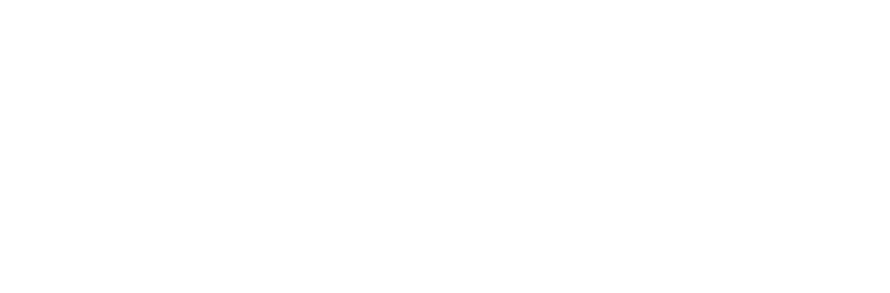
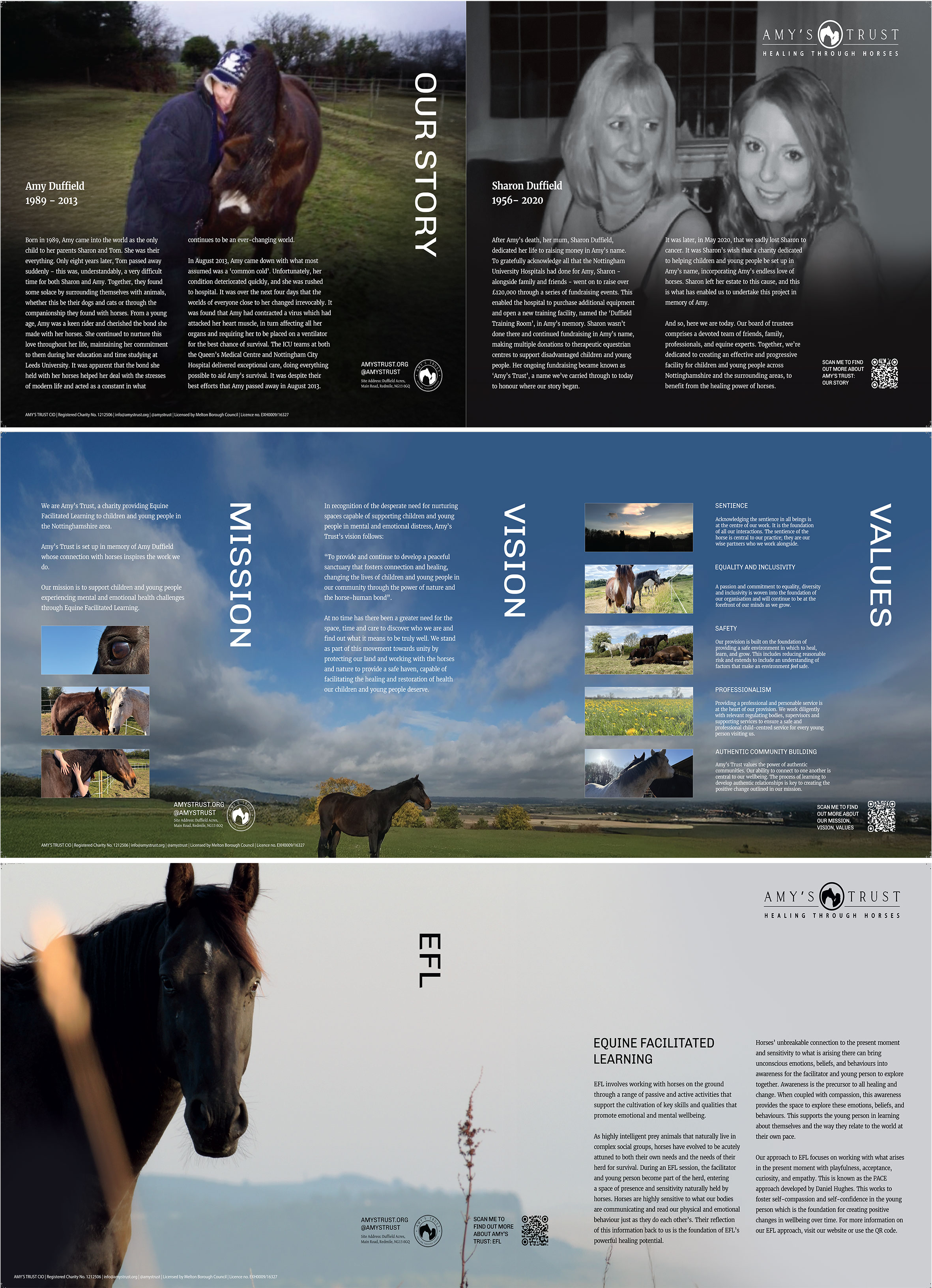
Amy’s Trust emerged from a unique convergence of profound loss, a clear healing mission, dedicated fundraising, and the right people coming together at exactly the right moment. Like most meaningful projects, it happened when all these key elements aligned. Understanding that story became essential to the design work that followed. The following slides were the first thing I was ever presented with when Amy’s Trust was in its incubation phase.
The Story Behind the Project
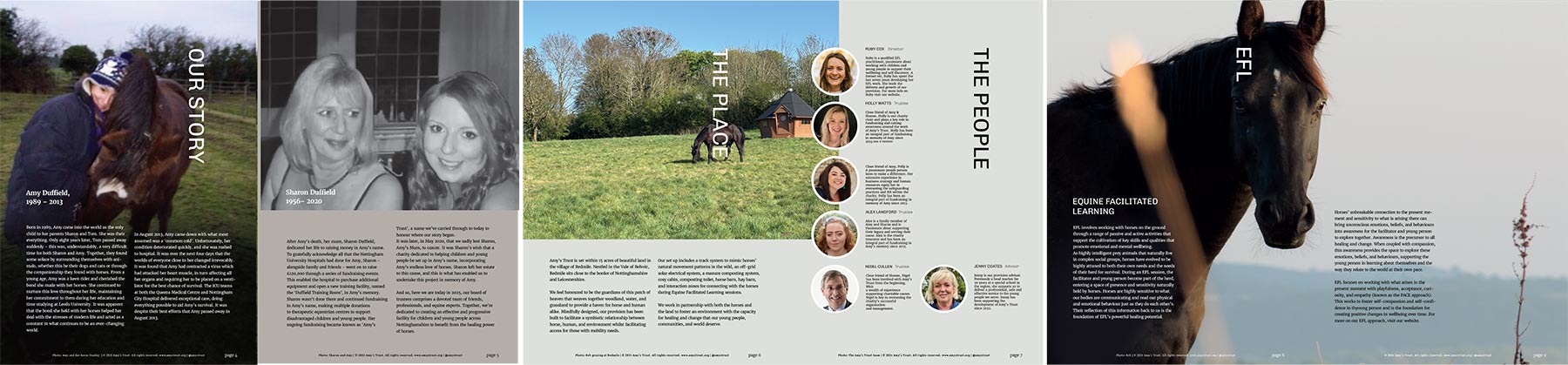
Amy’s Trust was born from loss and channeled into purpose. Amy sadly passed away suddenly at a young age, and her mother formed the charity as a way to create something positive from her grief. Ruby, who had grown up riding with Amy, had transitioned out of veterinary practice, re-trained and was growing her equine facilitated learning business just as this project needed someone with her particular combination of skills and dedication.
The charity was established to provide equine facilitated learning to children facing mental and emotional health challenges in Nottinghamshire, creating spaces where young people can find healing through connecting with horses.
Designing with Sensitivity
This project required more sensitivity than most design work. I was tasked with creating a visual identity for a memorial to Amy, which meant every decision carried extra weight.
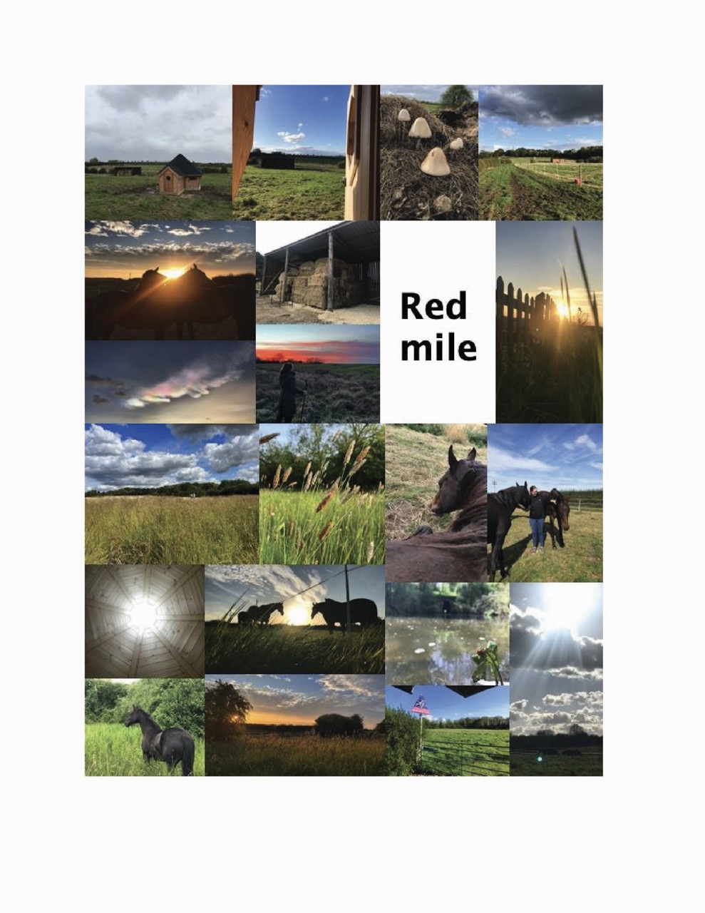
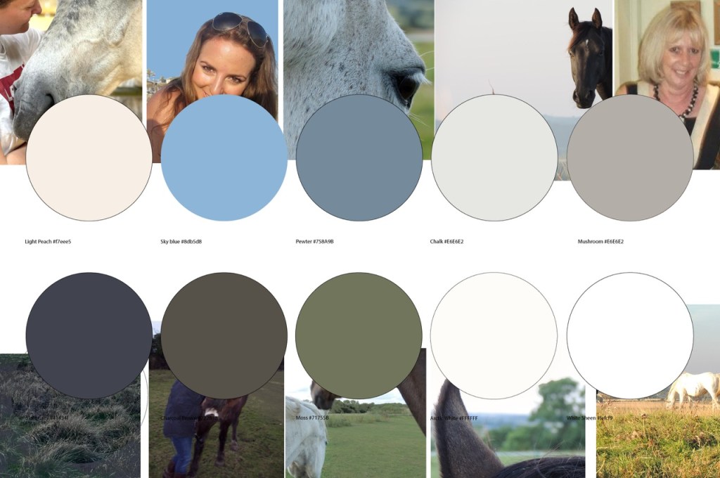
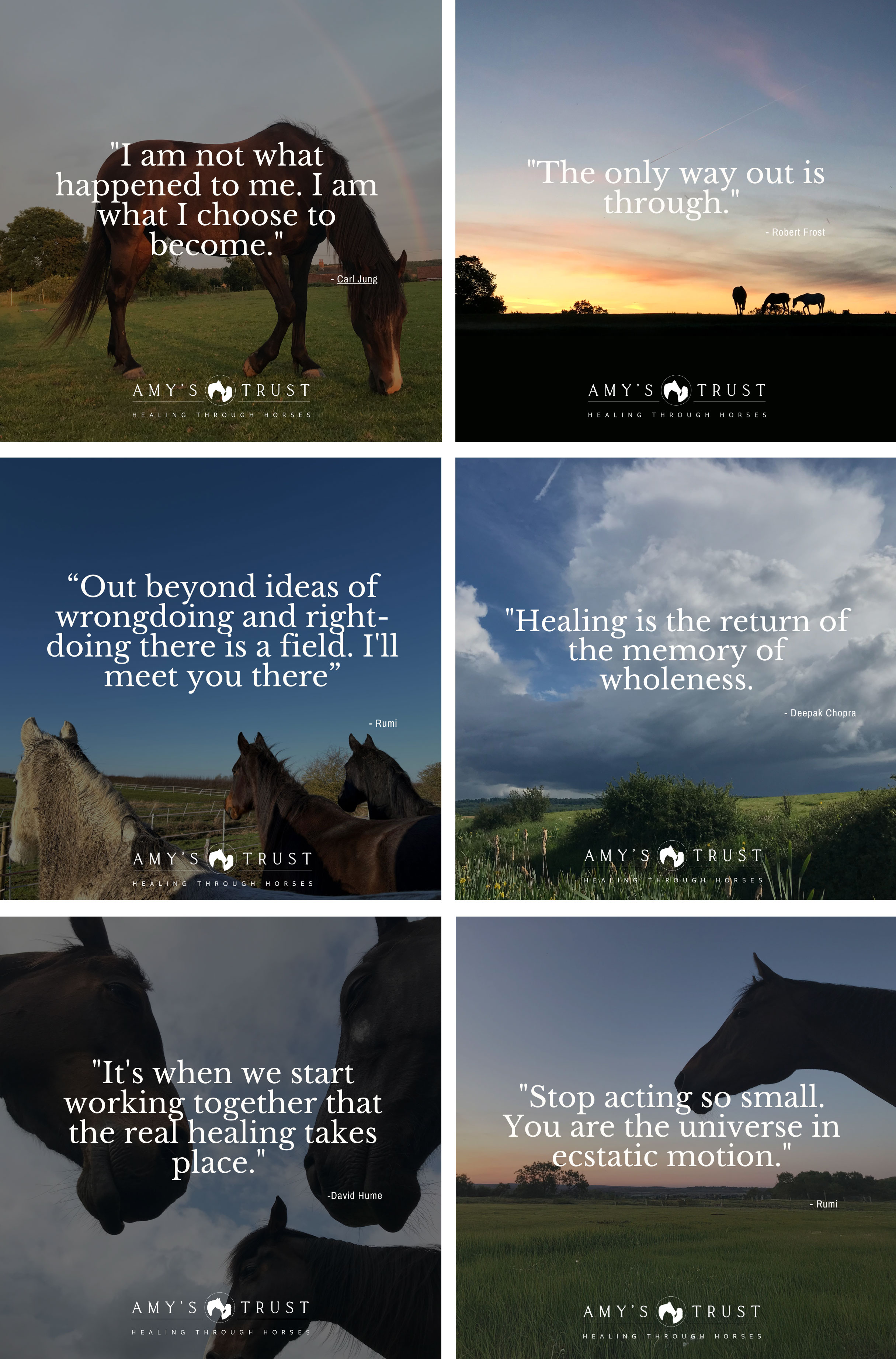
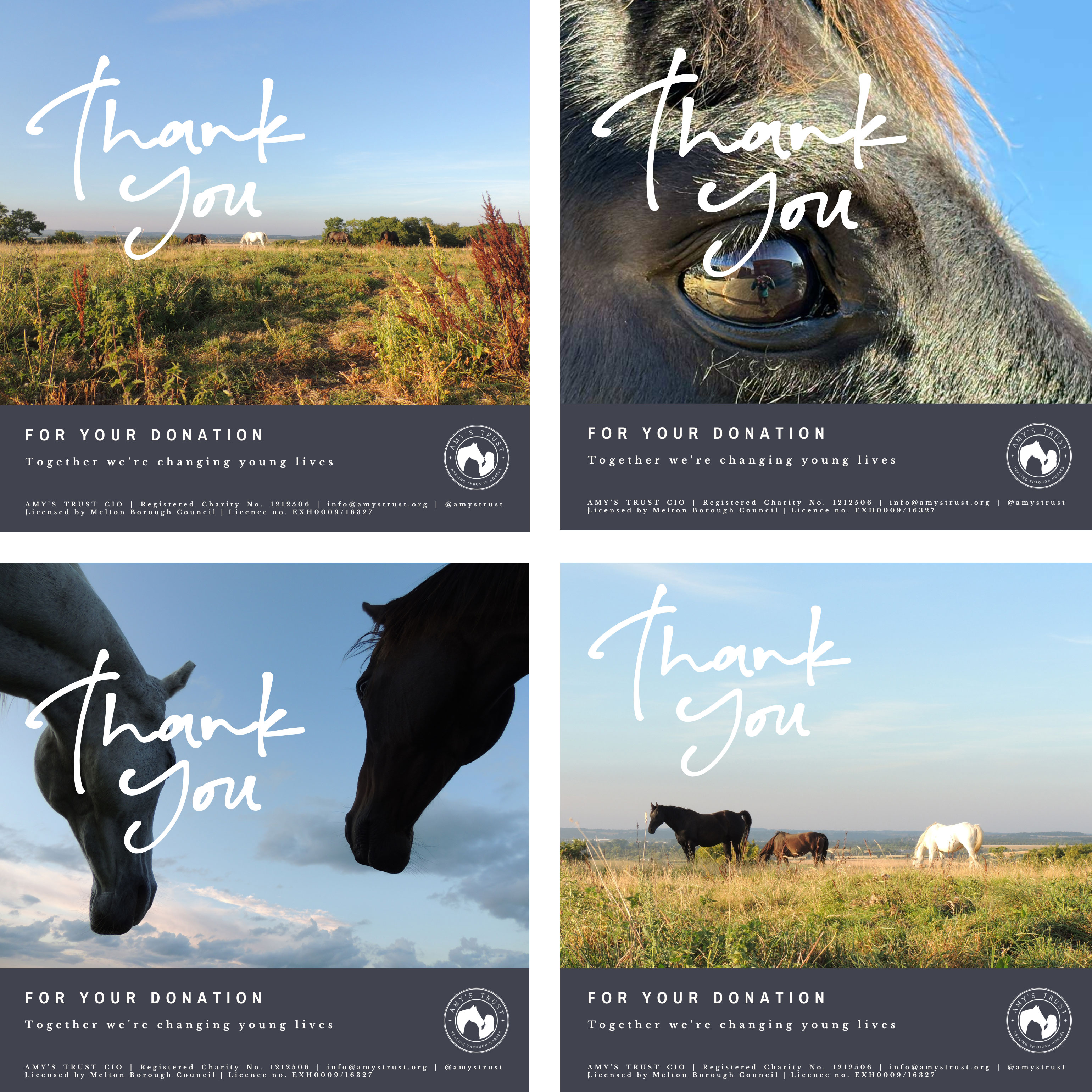
The colour palette came together naturally from the landscape of Redmile itself. We selected colours by taking swatches directly from the land where the work takes place – the fields, the skies, the horses and the people that collectively make the project. These felt like honest choices rather than arbitrary design decisions and set the design work off in the right direction.
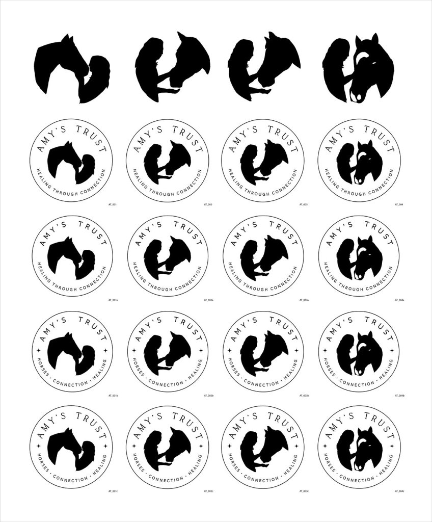
The Logo dilemma
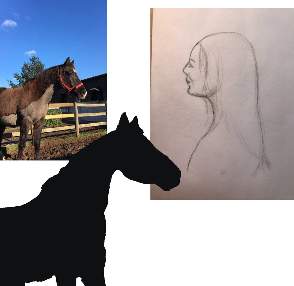
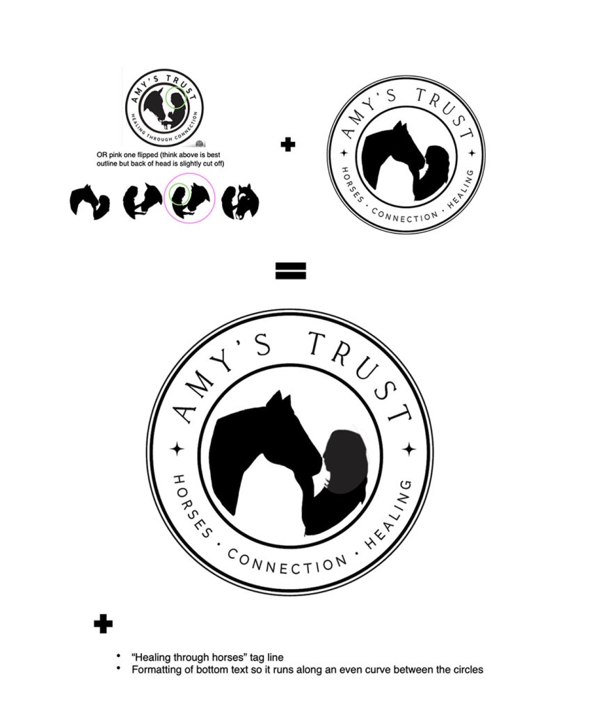
The logo presented an interesting problem. The trustees wanted a silhouette of Amy with her horse Stanley in an emblem design. The challenge was that no suitable photo existed—Amy died in 2013 when most photos were taken with lower-res camera phones, and none captured the specific pose that we needed.
The solution came when Ruby began drawing Amy and Stanley by hand. Working with her hand drawings, I was able to develop and refine them into the final logo with the trustee’s chosen tag line – “Healing Through Horses.”
Form follows Function
This project went deeper than that governing principle that I had learnt at at Art School and Uni. I found myself considering not just how things looked, but tuning into the energy of the whole project: the horses, the people involved, and the work this organisation will do.
Good design should be invisible – in that it shouldn’t distract from the project but should support everything about it. The serif fonts of the logo were selected to feel gentle without being too precious. Headlines had to be functional, punchy and clear. Body text needed to be readable and welcoming while maintaining professionalism.
The earthy, organic colour palette was designed with accessibility in mind, ensuring sufficient contrast ratios for all primary text and background combinations. These neutral tones were more than an aesthetic choice – they provide excellent accessibility across all applications while feeling grounded and calming.
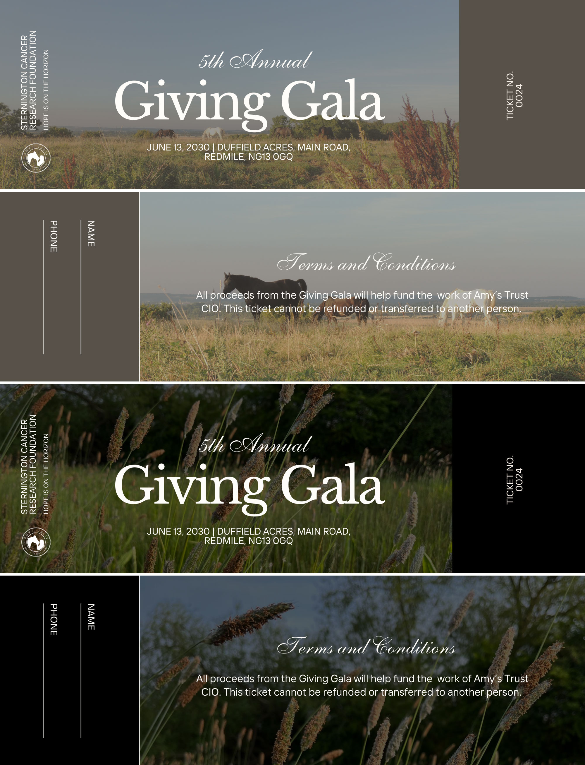
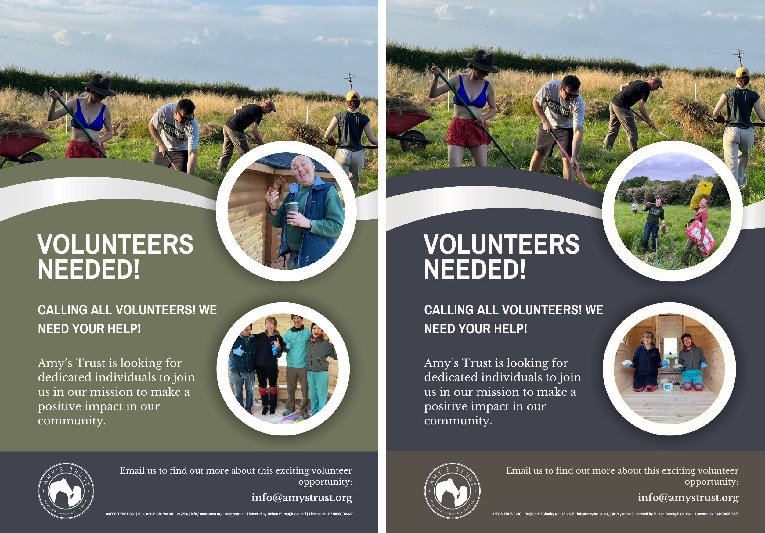

Embedded into the design brief was that everything – logo, brochure, flyer, social, signage, website – needed to work for a single parent on their phone, possibly struggling while caring for a child with additional needs. This requirement became our guiding principle, shaping every decision from colour contrast to button sizes to the simplicity of navigation. We weren’t designing for an abstract audience; we had to serve real people facing real challenges, while creating something with lasting strength and elegance.
The identity system needed to work consistently across wildly different contexts – from roadside signage to Instagram posts to sensitive printed materials for families. Each touchpoint was carefully considered and designed to carry the same message of hope and healing, regardless of where someone first encountered Amy’s Trust.
Moving Forward
As I step away from this work, I’m so grateful to have been part of Amy’s Trust at this foundational stage. Helping give visual form to a vision born from loss and transformed into hope has been deeply meaningful work.
This project expanded my understanding of what good design can do. It’s nothing to do with exploring abstract concepts, but everything to do with creating practical tools that help real people access healing and connection.
The brand we’ve created will hopefully carry Amy’s spirit forward, welcoming families and children who seek the unique healing that comes through relationships with horses. Ruby, the trustees, the horses and everyone involved in this amazing project have reminded me why creative work matters: when it serves something far greater than aesthetics alone.
In Amy’s story, and later her mother’s, there’s a gentle reminder of life’s fleeting nature – how quickly everything can change. Yet within loss, there’s also the quiet energy of renewal and new beginnings. This doesn’t feel like an ending to me, but rather the start of the next chapter – for Amy’s Trust, for their meaningful journey ahead, and for my own path forward.
Andy
July 2025

A conversation with trustee: POLLY DELL’ARMI
At our 15-acre Redmile facility, Polly Dell’Armi shares the moving story of her friend Amy Duffield, whose unexpected passing in 2013 inspired her mother Sharon to transform grief into purpose. Through Sharon’s determination and love, Amy’s passion for horses has evolved into a living legacy that continues to enrich lives even after both mother and…

Leave a comment